Client:
MyTorontoProject Type(s):
- Branding + Identity
- Graphic Design
- Web Design
Completion Date:
August 31, 2017Intro
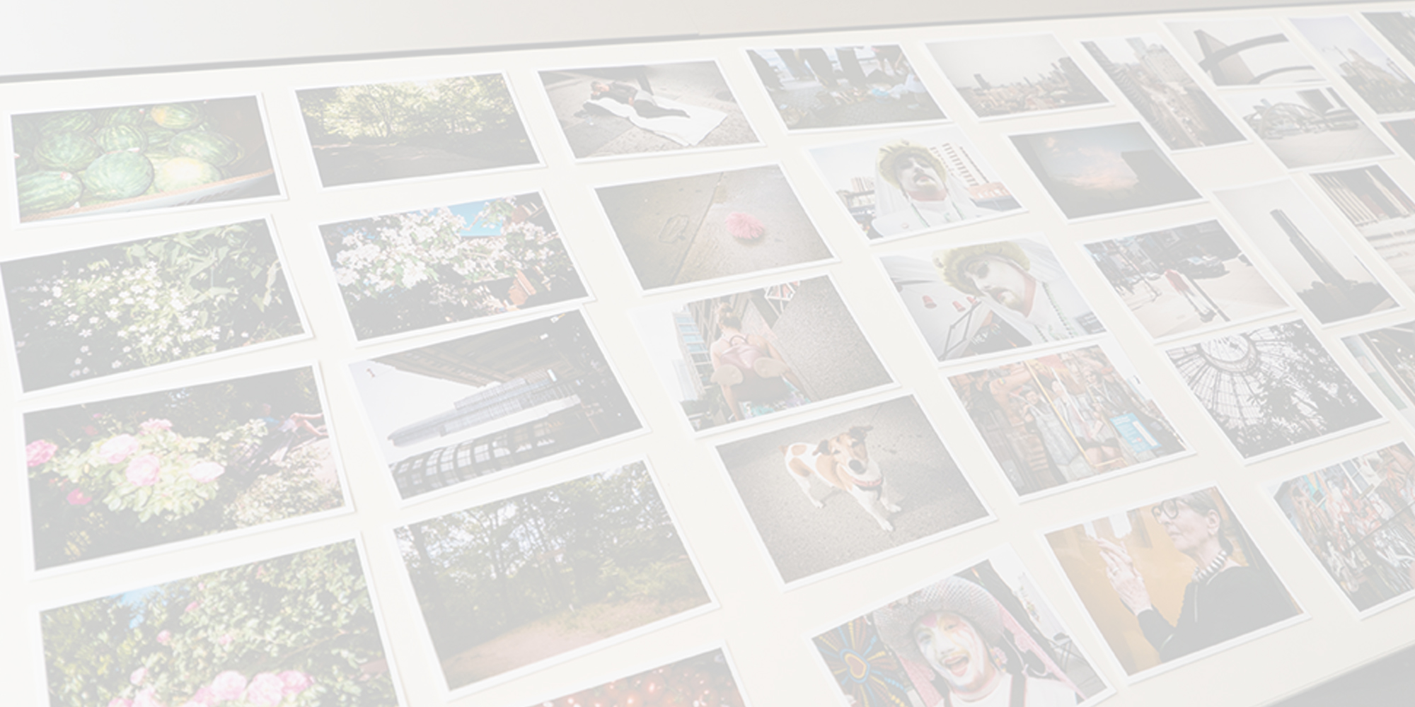
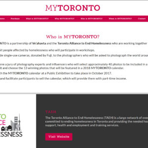
MyToronto was founded in 2017 in partnership between non-profit organizations Ve’ahatva and the Toronto Alliance to End Homelessness (TAEH) as a Canadian subsidiary of the UK-based MyLondon (itself founded by CaféArt). The organization is a photography-based competition where people who have been or who currently are homeless take photos of things that inspire them or that depict their view of the city. Each participant is given a single disposable camera to fill with photos over the course of three days and then returned to MyToronto for printing. The resulting submissions are judged by a panel of professional photographers and marketers – the winners themselves receive prize money, while the winning selections are included in a yearly calendar which is sold to promote homelessness awareness and raise money for charities that help those who are experiencing homelessness.
The Brand/Identity
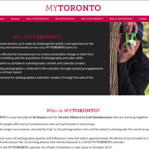
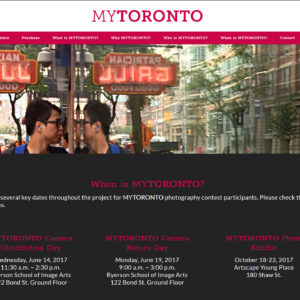
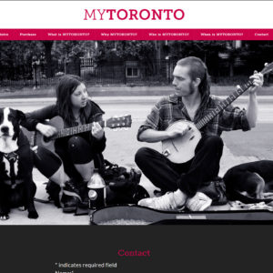
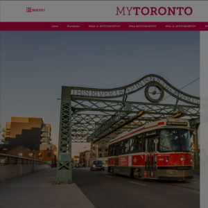
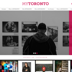
As the MyLondon brand had already been established as part of the original project, MyToronto would need to expand upon the original design with a more robust presentation. The matte berry/fuchsia pink tone was lifted from the original typeface and used for highlights and call-to-action elements set on solid white – much like the parent brand. Charcoal and black were used as inverted offsets to contrast with key white content areas. Photography from the parent brand’s first iteration was used along with stock photography of Toronto to help promote the upcoming inaugural Toronto edition, while a similarly-styled serif font would be used for any key messaging titles and headlines.
The Website
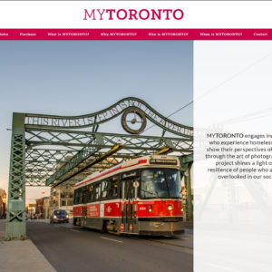
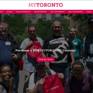
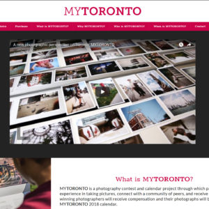
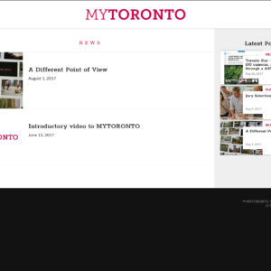
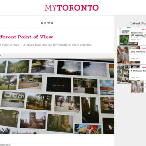
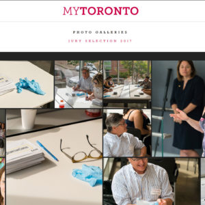
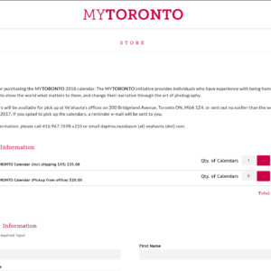
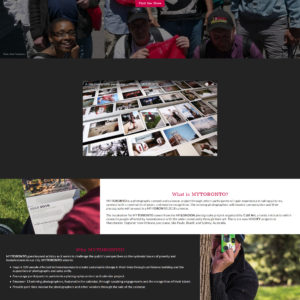
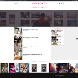
The website itself (launched in early June 2017) was conceived initially as a single-page site with auto-scroller menu using Modulus v.0.75, featuring a full-height intro panel and section blades that would cover the basic Who/What/When/Where/Why of the project. Additional content blades for a basic contact form and newsletter signup were also initially included before the site was expanded to feature custom photo galleries, a news section, a custom media clippings section (which highlights links to press articles about the project), and a basic eStore which would allow people to purchase copies of the completed calendar with selections for either direct shipping or pickup at the Ve’ahatva offices in downtown Toronto.
Updates
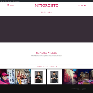
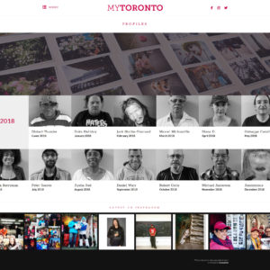
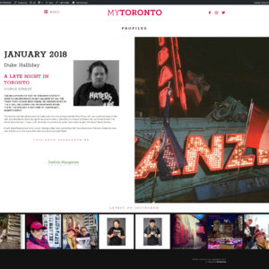
By November 2017, MyToronto had established enough content from their various events and news coverage that an additional upgrade was in order, streamlining and standardizing the site across all the pages and articles, and refining the brand/identity and user interaction mechanisms around the site for better cohesion. This also included adding header images across all key pages and article archives, adjusting the font sizing hierarchy, and building an additional future-proof “Profiles” system – which would continue to perpetuate profiles of each subsequent year’s 13 featured calendar photographers and their photographs.


