Client:
Hannah YakobiProject Type(s):
- Branding + Identity
- Graphic Design
- Web Design
Completion Date:
July 31, 2017Intro
In 2017 Hannah Yakobi was looking to establish a new brand for her online journalism persona. As editor-in-chief of fashion outlet FAJO, a non-profit communications professional, and a journalist with over a decade of publication experience, Hannah needed a way to encompass her entire brand in a slick modern container.
The Brand/Identity
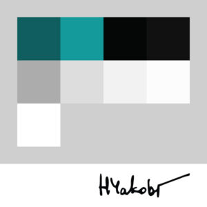
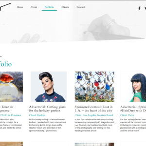
Key colour highlights were done in a near-aqua green colour tone for a bright and noticeable call-to-action while subtle grey tones on sidebars and items of lesser focus helped stand out from the stark bold black text and solid white backgrounds which were used to respectively embody the pen and paper motifs inherent to journalism. Initially using a serif-based font for headlines and items of interest (to embody an old-school typewriter typeface), we ultimately settled on digitizing Hannah’s actual signature and implementing it into the header for an extra personal touch.
The Website
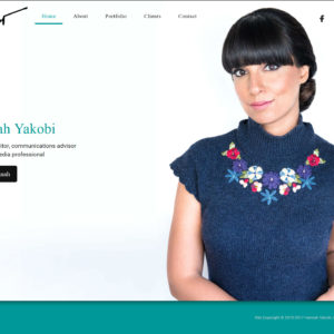
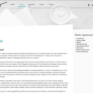
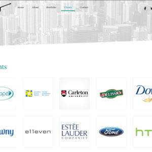
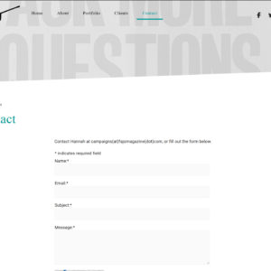
Hannah’s website was built on Modulus v.0.75 – initially conceived as a single-page website with auto-scroller menu to navigate up and down the site, the concept was expanded to separate each of the 5 content panels (Home, About, Contact, Clients, Portfolio) into individual pages to ensure the initial presentation of the website would setup for the future multi-page expansion. The homepage is presented as a locked carousel featuring a single image with potential for unlocking in later stages, the simple “About” and “Contact” pages are set within the same site theme, while the Portfolio and Client custom taxonomies allow for control over adding new title/link/image items into each system in both chronological and alphabetical order respectively.


