Client:
Cashmere Event StaffingProject Type(s):
- Branding + Identity
- Logo Design
- Graphic Design
- Web Design
Completion Date:
November 30, 2014Intro
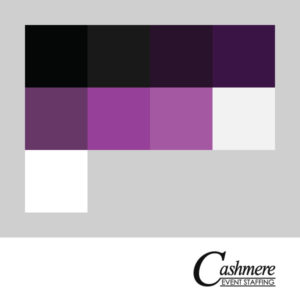
In fall 2014 Cashmere Event Staffing were looking to launch a multi-page website for their brand new luxury staffing agency – it needed several key features: basic lander pages, multiple contact forms, event photo gallery functionality, and an individual staff member profile system. They wanted to use purples and blacks as part of the branding aesthetic – while also highlighting an elegance in any of the scripts that would be used; leaning more towards a cursive hand-written motif; however, as the company was pre-launch, the design would need to stand on its own with no additional creative from the company – as there was nothing yet in existence.
The Brand/Identity
After a few rounds of talks and providing a basic PowerPoint mockup to illustrate what they were hoping to achieve, STRATASFEAR set about trying to hone in on a design that could embody their key message: luxury, flourish, and maybe even a hint of magic. The logo itself was designed to have a hand-drawn scrawling feel. While the idea was to capture a feeling of elegance, it was also of utmost importance to allow the logo the thickness it needed to be legible at small scale (i.e.: when used as a partner logo at the base of an event poster), and yet still have a regal prominence when blown up to banner proportions. After several iterations, the final Cashmere logo ultimately became a heavily-modified version of a serifed font – which would convey a classical regality to the brand – and a sans-serif subscript for a modern finish.
The Website
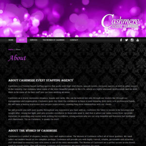
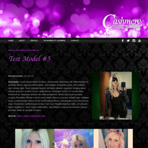
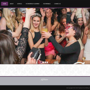
Like all STRATASFEAR web builds, Cashmere’s site is built on a WordPress backbone using version 0.6A of our MODULUS framework – Cashmere was also the first site to receive this version which included a more robust jQuery mobile menu than previous web builds. On the initial website, black stood in predominantly as a background colour, while various purple tones were used to highlight the user experience: headlines, link hover conditions/selections, and additional items of interest such as the sponsor/partner footer and the quote strip that appears occasionally on certain pages around the site.
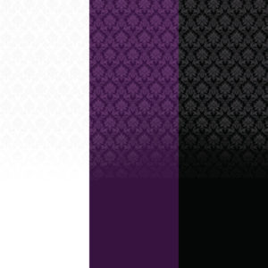
The heavily bokeh-ed header graphic was a custom build compiled from nearly a dozen stock images and skewed into the brand’s signature purple tones, while the subtle black/charcoal gradient of the full-width menu bar was designed to suggest the glossy feel of a makeup item – like a lipstick, compact mirror, or eyeliner – which one of the promotional staff models might carry in their purse. The patterned backdrop was also meant to embody the classy high-end feel of a private club – as though being on the site itself was something akin to gaining access to the much-coveted VIP section.
Future Updates
Cashmere was a moderately successful event staffing company for over a year and we were mid-update on Cashmere v.2.0, which would have moved the company more towards the cleaner textured patterns of the club aesthetic and lean heavier on the white/black suit-and-tie motifs of luxury event staffing. The project was never completed as the company joined forces and merged with fellow staffing agency Miss Social Entertainment, negating any need for further design/branding services under the Cashmere banner.


