Completed: Summer 2006
Spruce Hill Lodge Website
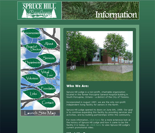
Spruce Hill Lodge is a non-profit organization with which I received a contract position for several months in order to redesign their website (which was atrocious…trust me on this one) and their marketing materials.
Over the course of approximately 2 1/2 months I gave myself a crash course in CSS and a refresher in Javascripting in order to improve the quality of my own web capabilities.
The Lodge (as it’s affectionately known) held a 5MB account free of charge with their Internet Service Provider – a service that most ISPs provide. If my design were to go over this limitation, the organization would then have to pay a monthly fee for something they didn’t necessarily need. This became an extremely important factor of the final design, as because of its status as a non-profit organization, SHL had to pay me for my services with a government grant…so I didn’t want to leave them in a situation where they would have to spend even more money.
It was for this reason that most of the design was done using Macromedia Flash and actionscript, so as to limit the file size and virtually eliminate the need for expansive pictures. This technique limited editing capabilities, however it was restricted solely to things that I felt wouldn’t need to be edited until the next big redesign, such as the title bars, interactive map, picture viewer, navigation bar and sitemap.
I had to produce a manual to teach them how to do basic revisions to the website (as that was part of the deal they made with the government to get the money to pay me in the first place – that they would remain self-sufficient), and to get around the file size limitations I hosted the video files and PDF documents on an empty tripod account that would act like a file server.
All in all the techniques worked out great, though I would highly recommend to anyone, if at all possible, to upgrade beyond 5MB for website hosting….that’s just WAYYYYYYY too small; I might have been able to work more adequately with 10MB, but c’est la vie!
Lesson Learned:
Never attempt to make virtual tour panoramas without a fish-eye lens for your digital camera…it wastes WAYYYYYYYY too much time and it’s a bloody PAIN IN THE ASS trying to get pictures to line up and stitch with each other!


