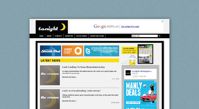
I’ve been working on the new website for t.o.night Newspaper for the past several months; going back and forth with publisher John Cameron and VP Tom Hyde to make sure we got everything included that we needed (with future foresight in mind, of course)
Man did that thing need a re-work (see below).
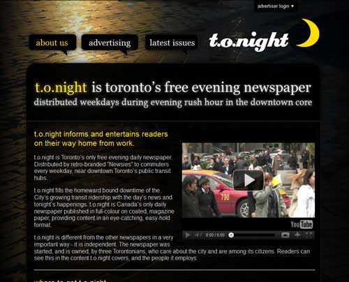
I’m not entirely clear on the building process for the original website – since it existed before I was brought on as t.o.night’s Art Director – but based on the formatting of the code itself and the fact that there was no back-end structure (so all the pages were all individual HTML files) I was willing to lay bets that the guy that built v.1.0 did so in Microsoft Frontpage.
…which I didn’t even realize existed beyond the early 2000s… let alone was still used to make websites.
This was especially annoying whenever we wanted to add something new to the website, as the custom graphics (let alone the layout structure itself) were not conducive to being tweaked very easily, and often led to a great many headaches when trying to figure out how to integrate new video boxes or side pages.
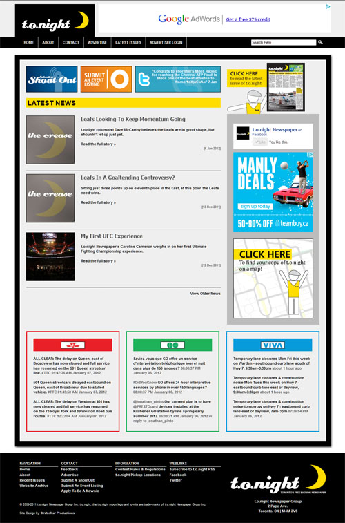
What we ultimately came up with for this new version (seen above) was to emulate the basic look of the daily publication with a prominent white esthetic and thick black-bordered framing to reflect the cover of the newspaper.
Other than the typical blog-style article posting features, I set up a triple-twitter feed pull across the main page for the three prominent transit services in Toronto to accommodate our primarily commuter-based readership: the Toronto Transit Commission, GO (for the greater-Toronto outskirts areas), and VIVA (the prominent transit line north of the core Toronto area).
Separate contact pages were setup for each individual email submission type – general contact, shout outs, events, advertising, and newsie job applications. We also had some great photography on the side pages from one of our newsies – herself, a budding photographer – which really helped bring everything together.

I also maintained the front-end login feature for advertisers to upload material to our server, though I updated it into a jQuery drop-down strip that hides behind the menu bar for just a tinge of playfulness to the design.


