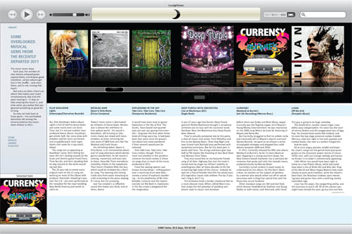
This week I got the chance to put together a REAAAAAAALLY fun layout.
We found a wire story from the Associated Press on their picks for the “Top Overlooked Albums of 2011” – nothing really mainstream about the list (unless you count Deep Purple as mainstream), though I had heard of most of the list from my typical indie music immersion through The Indie Machine.

It was kind of a last-minute thing, as deputy editor Mike asked me to see what I could do with it; keeping in mind that there was a possibility that it wouldn’t end up running based on whether or not Metro would run it the next day…
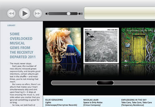
This iTunes-inspired beauty was my Thursday afternoon at work, so Luckily for me they didn’t end up running it.
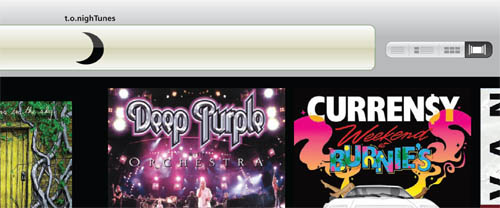
I lifted most of the colours off a screenshot of the iTunes interface, though the majority of the design work was just eyeballing the design and laying out the document to match (subsequently swapping the iTunes title & Apple logo with the t.o.nighTunes label & moon logo) – leaving me quite happy with the way this one turned out.


