Sifting through my computer this past weekend – while in the process of transferring this website from my old Byethost account to the more reliable Bluehost – I came across a digital project I’d completely forgotten about.
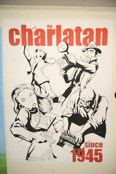
Back in the fall of 2008, while still attending Carleton University and acting as Production Manager at the student newspaper The Charlatan, I took it upon myself to clean out the production computer in preparation for the impending publication redesign and changeover to Adobe InDesign. I ended up tossing mounds of documents into the trash bin, though one piece I did find of interest was a low-res image capture of The Charlatan’s mural in the student-frequented tunnels beneath Carleton’s campus grounds.
I’m still not entirely sure when the piece was designed, though it features the Charlatan’s late 90s logo update to the font “Impact”, and I really liked the 1920s “newsie” esthetic to the piece, so I decided to recreate it for use in our own contemporary publication, web, and marketing.
First off, I took a digital photo of the mural itself – fairly crude, especially with the dirt and custy food smears on it, but it gave me a jumping-off point.

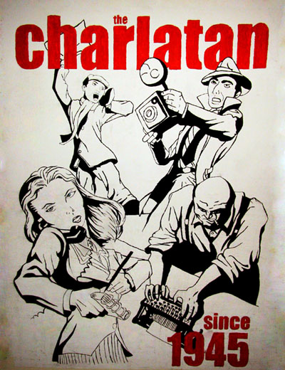
Next, I duplicated the photo in Photoshop and multiplied the layers with different darkening effects in order to clean up all the dark lines that outlined the characters – I recall having particular trouble with the paperboy in the background as his facial features hadn’t aged well and I had to curve it really dark initially to make out the appropriate lines I needed to restore through slight colour and shading variations.
After cleaning up the food smears and the discolourations with a clone tool and healing brush I rebuilt the lettering that had chipped away and it gave me a fairly solid image to work with.

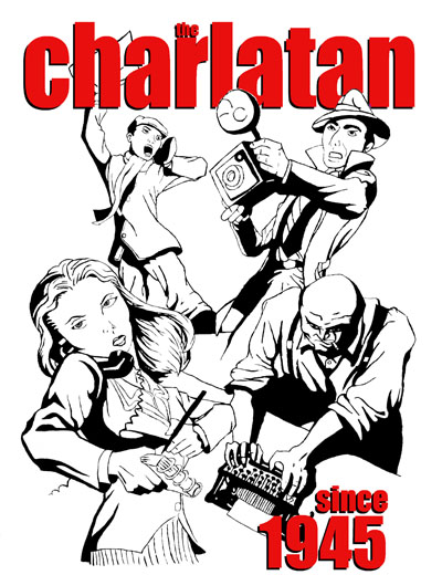
Finally I once again duplicated the layers, but curved things in the opposite direction to really bring the white background back into focus – there may have also been some use of the magic eraser tool here at this point and some readjustment of black lines afterwards. The text was fairly easy to fix with a red-on-black shadow effect after all of this simply because I happened to know that the font used was “impact” because we still used it in the print version of the newspaper at the time.
All in all, it turned out super crisp, and we were able to print at 300DPI and use it once again on the website.


