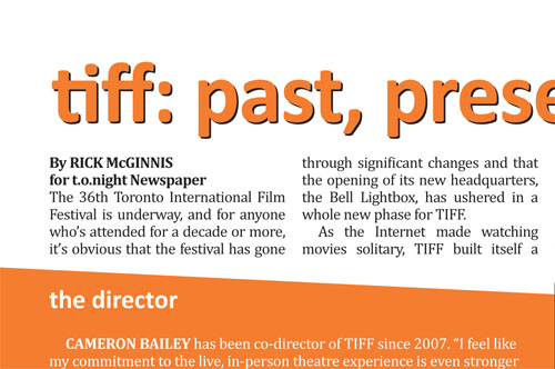

Today we ran a TIFF feature in t.o.night by wondrous wordsmith Rick McGinnis – he did an overview of the festival by covering the major angles involved, speaking with festival co-director Cameron Bailey, Canadian actress Nadia Litz, Globe and Mail film critic Liam Lacey, and a couple avid TIFF attendees. It was actually much longer than the printed version (though since I wasn’t the one editing the piece I can’t say for sure HOW MUCH longer), but it still comes across as a solid and fun inside look.

I tried to make the design reflect the festival a bit, lifting their colours off their website and using a sans-serif font for the headline, subheads, and cutline name tags along with our typically Cambria body font. Ironically, by using our sidebar sans-serif font Calibri, bolding it, and subsequently blowing it up to headline proportions, it seems I unintentionally discovered how little money was pumped into the logo creation budget for one of the largest internationally renowned film festivals – since Calibri has been the default typeface for Microsoft Word since 2007.
I can’t say I’m an expert on this; this may not have been the exact method of the logo’s creation – and this is not to say that I don’t like it for it’s simplicity and immediately recognizable appearance – but it appears as though it were typed in Calibri and vector outlined in Adobe Illustrator before extended the letters out to be evenly extended in height.
Just sayin….