Throughout the duration of the 2008-2009 school year – my fourth at Carleton University – I held the position of Production Assistant (technically Production Manager, though that’s an entirely separate story) for the university’s student newspaper The Charlatan.
Having spent the three previous years slowly integrating myself within the paper’s student volunteer ranks – first as a reporter and photographer, then copy editor, and finally by third year as the web coordinator – I was well versed in most things concerning the paper’s design, both in print and on the web, and so it was much to my pleasure when the new editor-in-chief, Chris Hannay, approached me and voiced his desire to redesign the paper in order to improve readability and maximize the usage of page space for both editorial and photographic content.
The design hadn’t changed much in the time that I’d been attending Carleton – save for a few tweaks here or there. Our design at the beginning of the year followed a tabloid-magazine style: featuring a magazine-style cover page followed by newspaper-style news and feature sections – something we were very keen to maintain; however, we were hoping to improve the efficiency of the publication, beginning first with switching from using Quark Xpress for production purposes to Adobe Creative Suite 4’s new version of InDesign.

Building up to the transition between first and second semester, Hannay and I tried to find a way to make the cover as interesting as possible simply in order to have time to experiment with ideas (as we’d begun planning the redesign from the outset of the first semester) – in these cases this was mainly through the use of different fonts and the physical layout of the cover page. Changes within the paper would have to wait though as stylistically we felt it wasn’t to our advantage to begin a slow transition by tweaking page elements on an issue-by-issue basis.

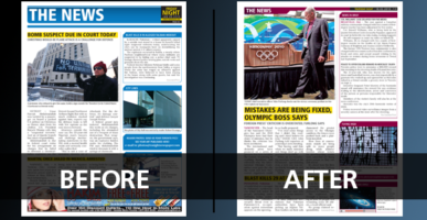
Ultimately, the Charlatan’s pre-redesign layout style was functional, but the quality of this functionality was fleeting: spacing was cramped, text extended over multiple lines and the page elements often felt as though they were being layered on top of each other.
After several special redesign committee meetings – consisting of the editor-in-chief, myself, the editors, and various volunteers of the Charlatan community – Hannay and I developed a cleaner, more modular-based system for the page elements that would allow for better spacing and readability, ultimately launching with the first January issue for the second semester.

Various steps were taken to improve the style of the publication: changing fonts, increasing the required spacing between elements, removing the bottom folios on the page and integrating them within the section headers, and redesigning the various page elements (sidebars, pull-quotes, lift-outs, etc…) to create a better visual draw, as well to create as a better reflection of the overall visual theme of The Charlatan.
The latest (as of this posting, current) version of the publication logo, which was developed in the late-90s publication redesign is written in a standard “Impact” font, and it has been the most iconic of the various renditions of the logo since the paper’s founding in 1945 – both through its ease of creation and its use in widely-propagated marketing: this iteration of the Charlatan logo has been printed on everything from mugs and t-shirts to pens and bottle openers. As such we felt that the thick black bars as headers and footers, and the inclusion of lines around the article bylines would be a better visual match to the thick sans-serif font, and create a greater uniformity in the publication as a whole.

We removed the teaser boxes from the publication’s cover (as everyone on staff had tired of them and adamantly voiced their opinions against them), upgrading instead to a single black ticker across the bottom of the cover which allowed us to tease one additional story as well as some of the exclusive online content. Because of this, there was now much more space on the cover for design work, and it allowed us to focus more on the magazine style of cover design. As such, I often sunk the publication title behind the object in focus and tried to match the fonts with the style and key colours in the cover photo.


Because we became much more focused on augmenting spacing and improving visual style, I would often go back to the editors’ page layouts in my design read-throughs before submitting the files to the printer and “jazz” up the page – in the case of the candy story seen here, I rebuilt the house ad to reflect the dominant colours of the photo on the page, while on the economics story I matched the “then grey” arrow to the spot-colour red tone of the dominant ad on the page. I tried to do things like this as often as possible with colour matching as it simply created an additional visual draw on the page.

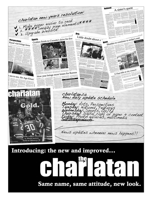
Finally, to officially launch the new publication (and new website, which was concurrently being created by the 2008-2009 web-coordinator, and my successor, William Hearn) I designed a full-page advertisement that ran in the first issue following the redesign to explain what we had done.
I was really happy with the way things turned out for my first publication redesign, and I felt the staff was also really keen on a lot of the changes that we ended up making – especially in the spacing department and Adobe element workflow that allow for faster layout turnaround.