In previous years at The Charlatan – or at least in the time that I was there starting in 2005 – the features section editor had run a joke supplement at the beginning of April to coincide with April Fool’s Day; however, in the 2008/2009 school year the four yearly supplements were removed from the publication in favour of two semesterly-published magazines.
Due to popular demand from the staff, our Editor-in-Chief in 2009 caved (in part because he too was a big fan of the joke supplement) and so a joke supplement was a prominent feature within the final issue of the paper for the 2009 school year.
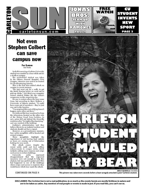
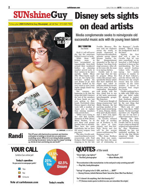
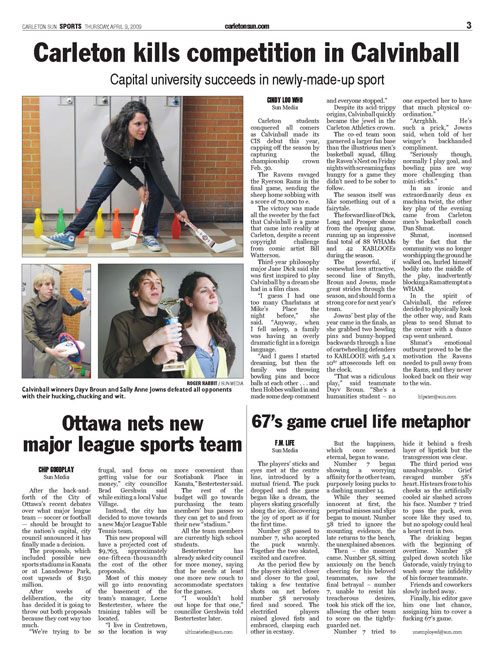
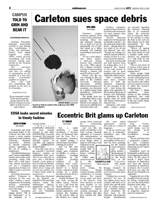
Ultimately we decided on emulating the style of a “Sun” publication – and so I set out to ensure the supplement looked as much like one as possible: fonts, headlines/deks/story credits, spacing, line dividers, page elements, photo/caption style – I enjoyed putting together our second page in particular featuring our very own Sunshine Guy… why should the girls have all the fun?


