Client:
SIFA GroupProject Type(s):
- Branding + Identity
- Copywriting
- Graphic Design
- Web Design
- Photography
Completion Date:
June 01, 2019Intro
In 2019, burgeoning Toronto accounting firm SIFA group was expanding quickly — working with well over 500 clients in the spring 2019 tax season. Augmented by their popular – and hilarious – tax memes on Instagram and Facebook, SIFA needed a proper website and a branding facelift to help give prospective clients a better idea of available services, housed in an all-inclusive location.
The Website
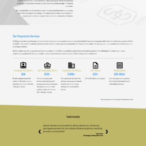
Setting up a basic one-pager site using a Tier 1 Modulus framework build, we gave SIFA a basic multi-panel setup that would help guide clients through an intro to the company and its services. This included a custom Services system that would allow the accounting firm to manage available services/pricing/descriptions, but also allow for future expansion into each service having its own dedicated page as the company continues to expand.
The Brand
We also arranged an on-site shoot in the SIFA offices, capturing photos of some of their letterheads, stationary, office decor, and CEO Spencer MacIntyre himself for a more face-forward brand presence. Additionally, rather than opt for the often-used “money green” tones seen across the financial industries, we decided in favour of a subtle gold tone and a bright blue for accent colours alongside their pre-established black-and-white aesthetic.
Moving ahead, Stratasfear will be helping SIFA Group develop their new branding and marketing materials as the firm prepares to relocate to a new storefront location in the fall of 2019.


